Life Clock for KGC
2017
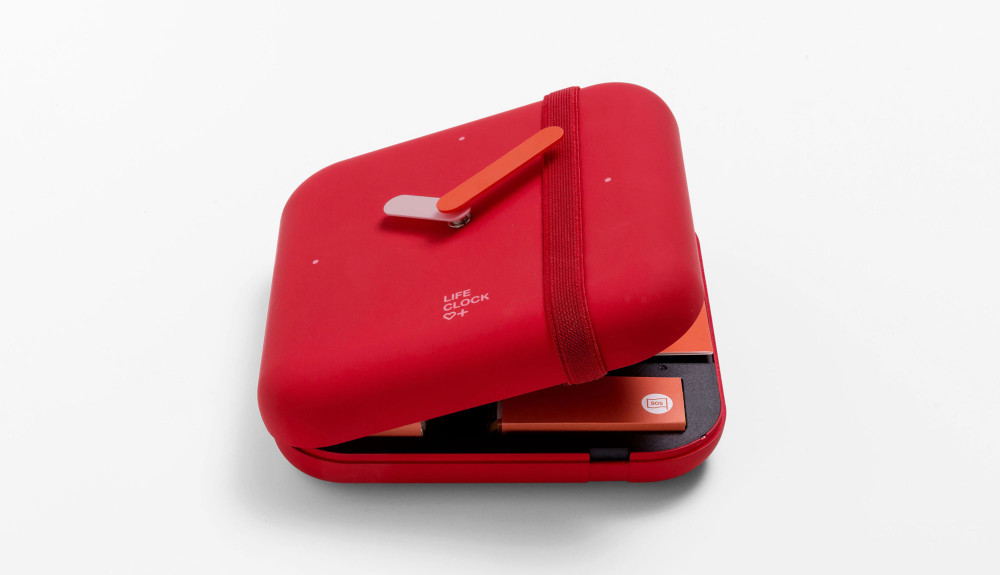
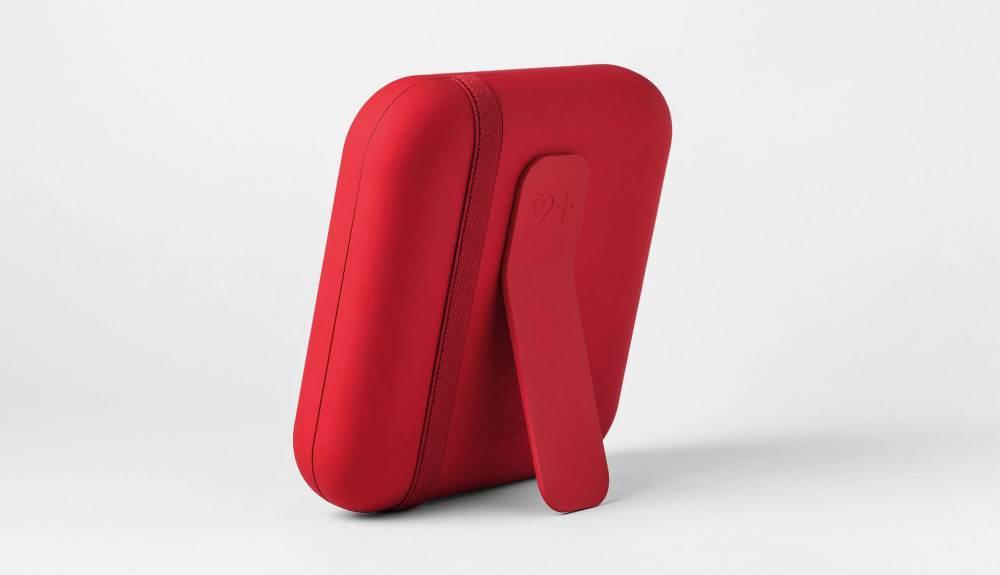
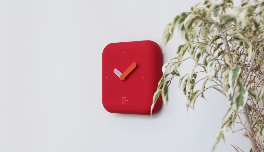
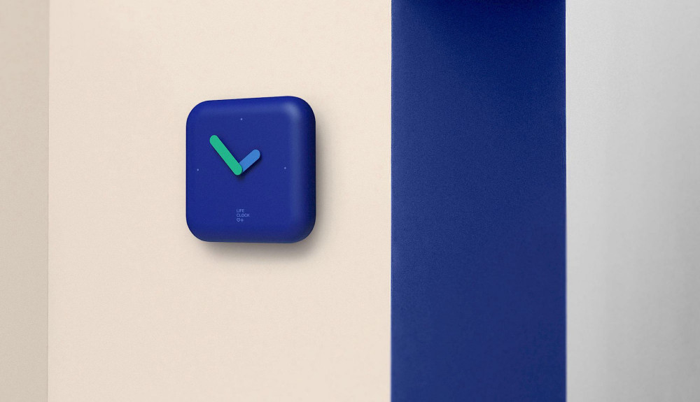
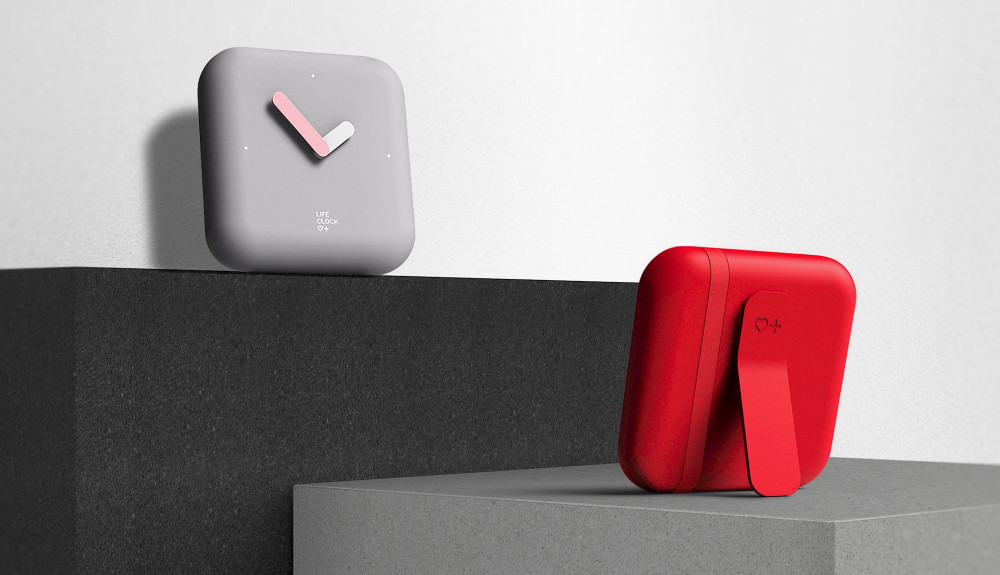
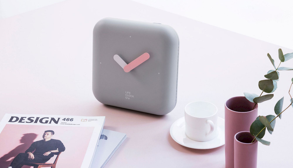
The "Life Clock" utilizes the metaphor of a clock to seamlessly integrate emergency tools into daily life, avoiding the perception of being an unfamiliar or emergency-only item.
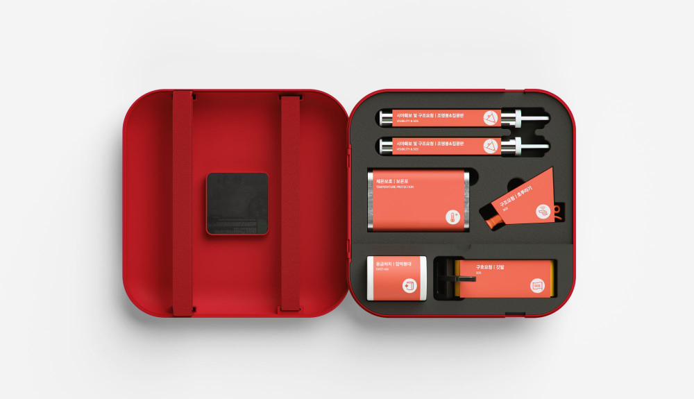
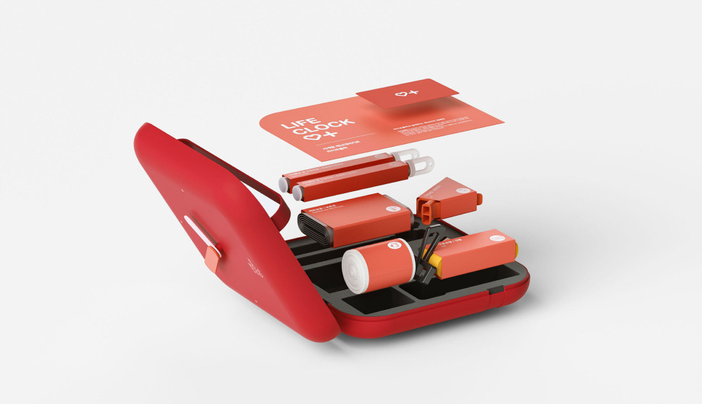
The design includes essential components such as a glow stick, an aluminum wrap, a thermal blanket, an emergency compression bandage, a whistle for signaling location, a distress flag, an ICE (In Case of Emergency) card to record personal medical details, and a disaster response guidebook.
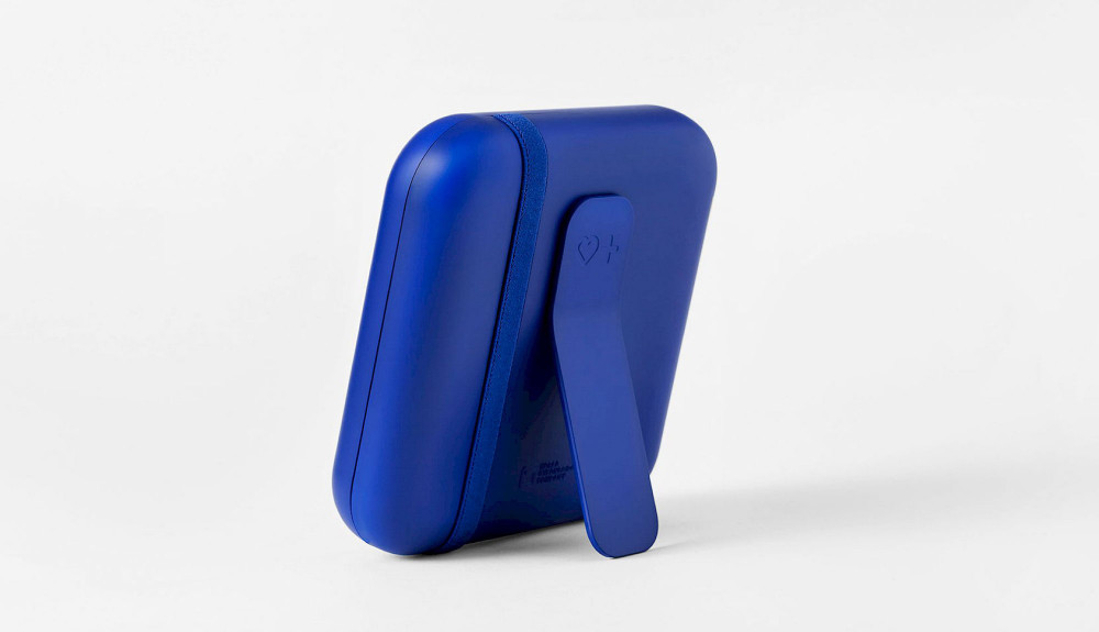
Life Clock functions as both a clock and an emergency kit, designed to fit within home decor. Through this design, it aims to raise awareness that disasters can occur at any time and encourage people to view emergency supplies as more familiar, accessible items.
