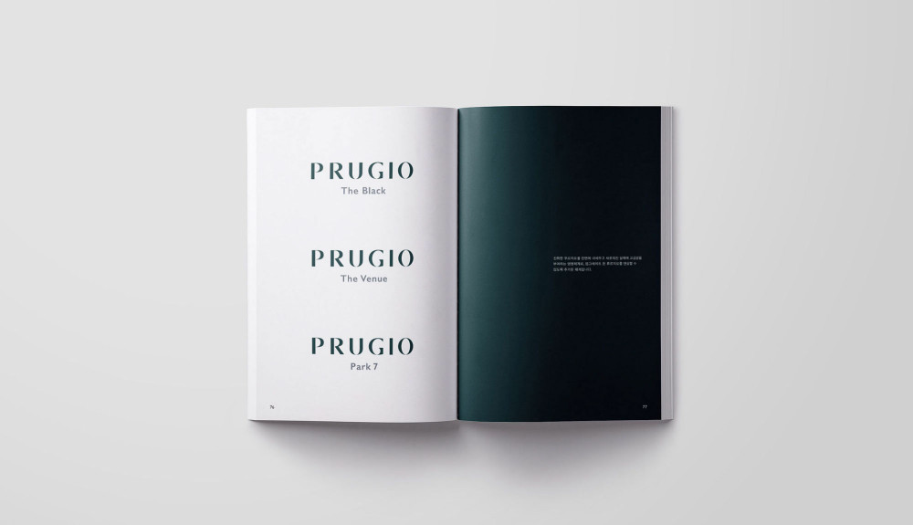
The Prugio underwent a comprehensive master planning process that included brand strategy, architectural design, and marketing, ultimately redefining itself around the core value of "The Natural Nobility." This repositioning remained true to its essence, representing a significant shift from its previous eco-friendly image. The brand naming strategy was reorganized to highlight the apartment complex's characteristics.
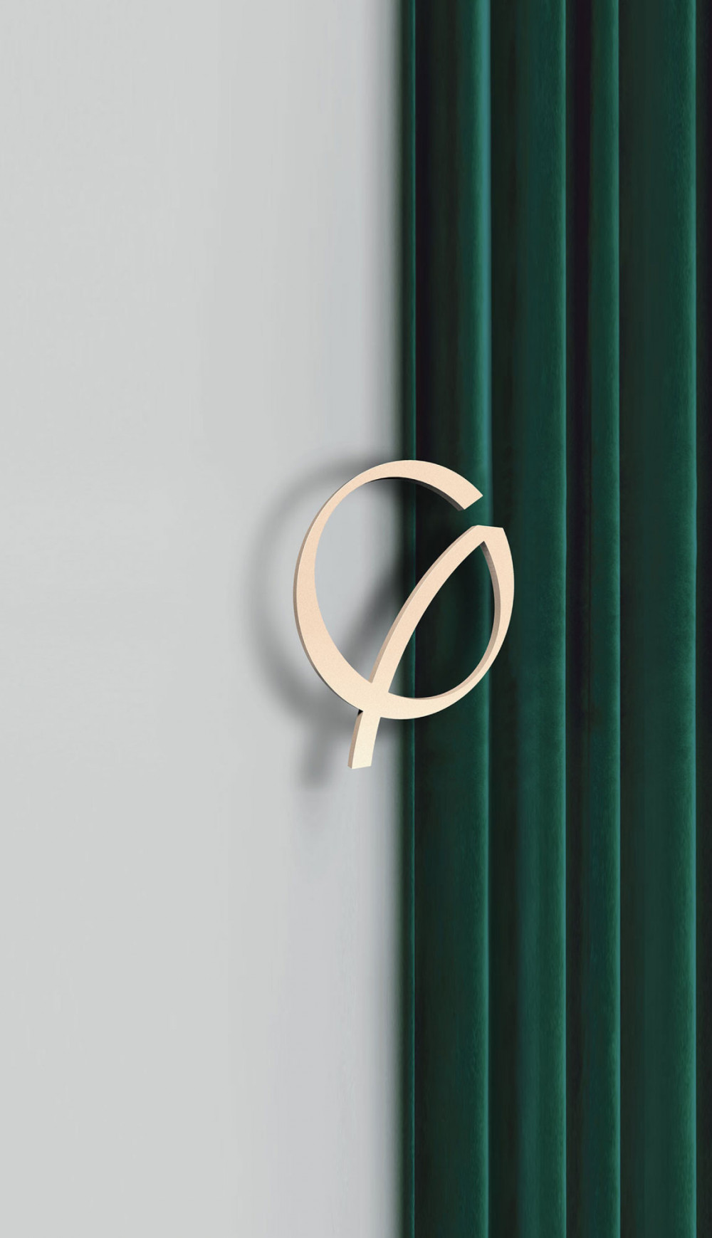
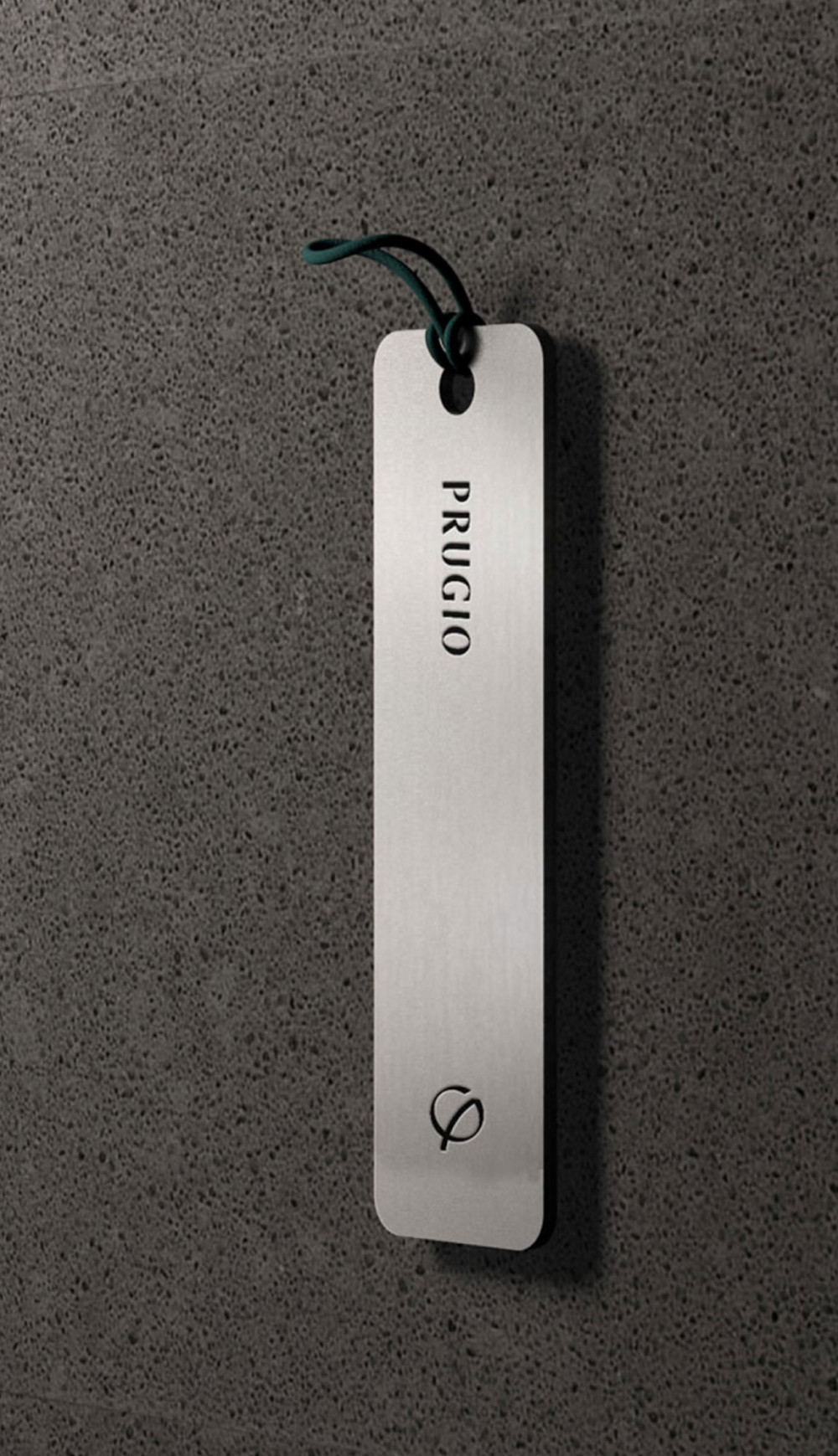
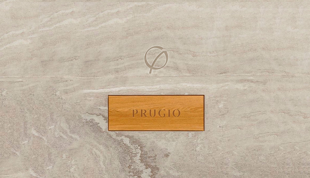
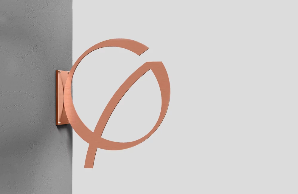
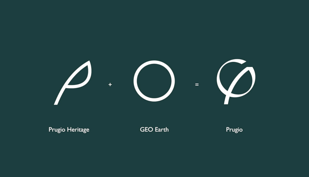
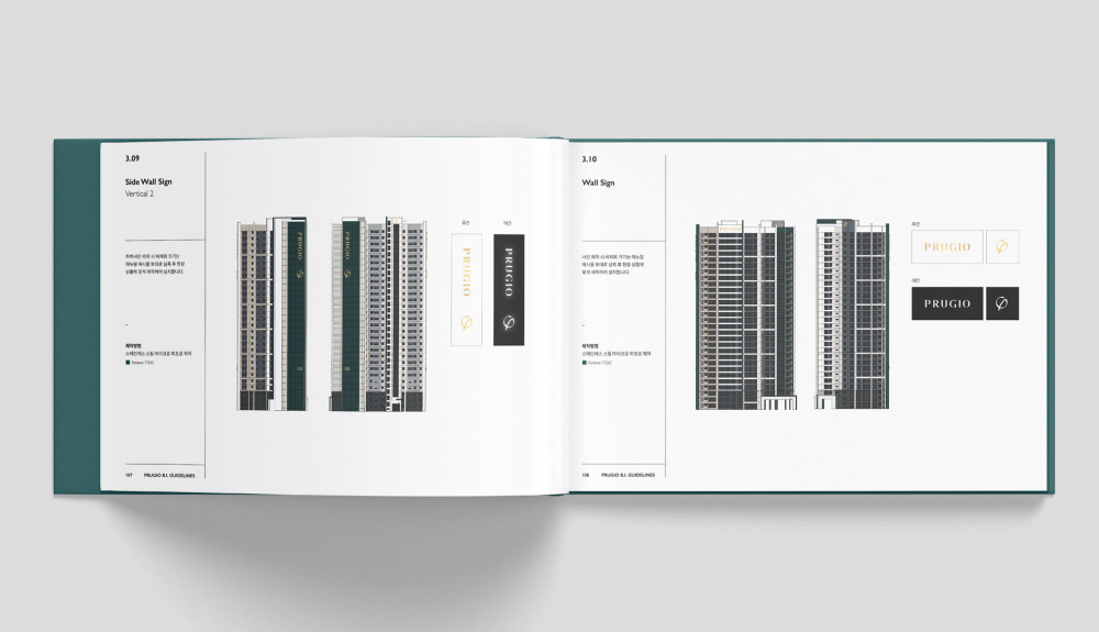
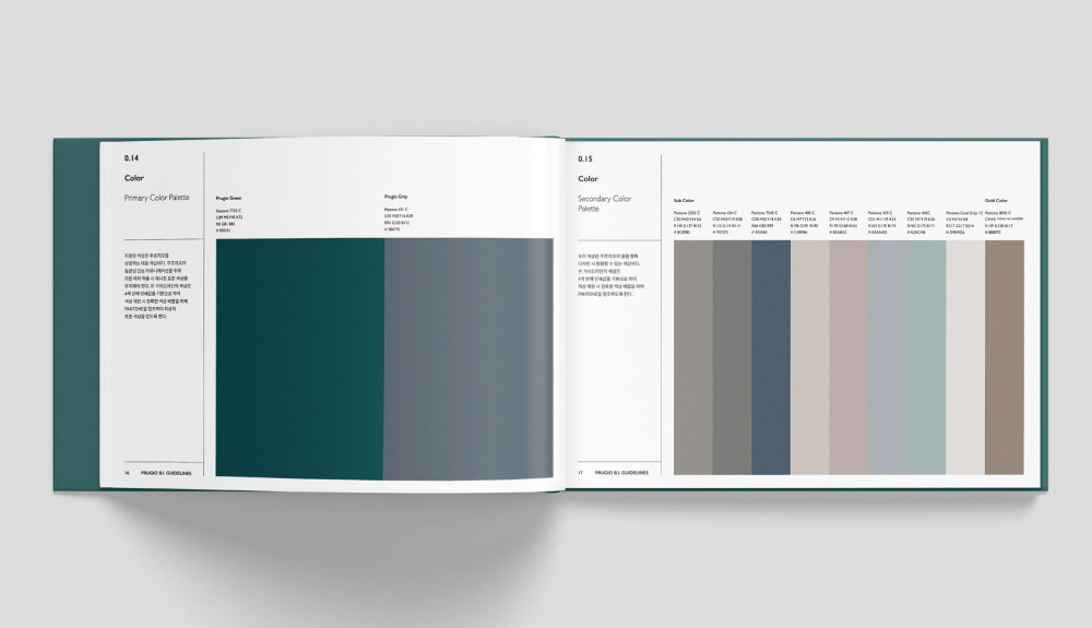
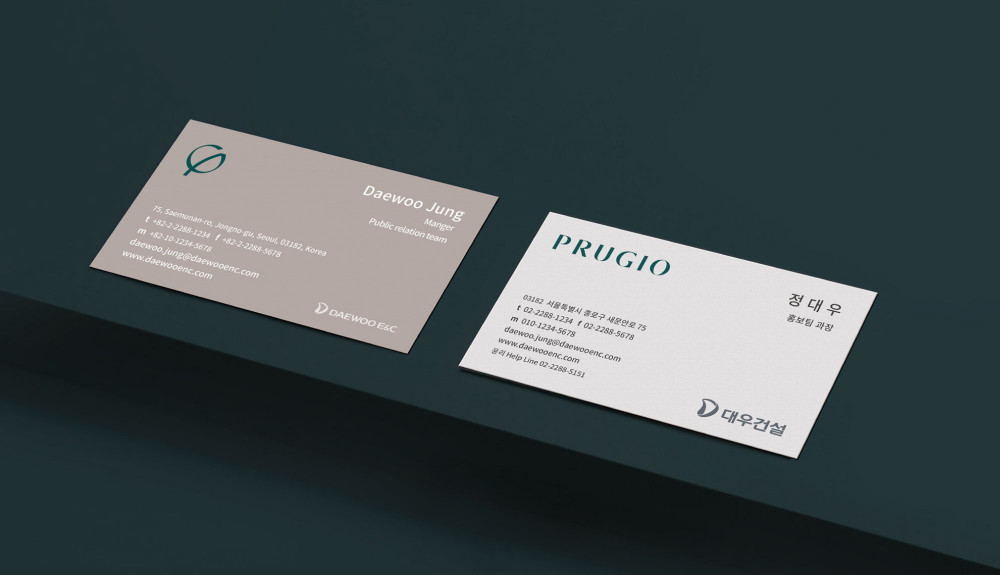
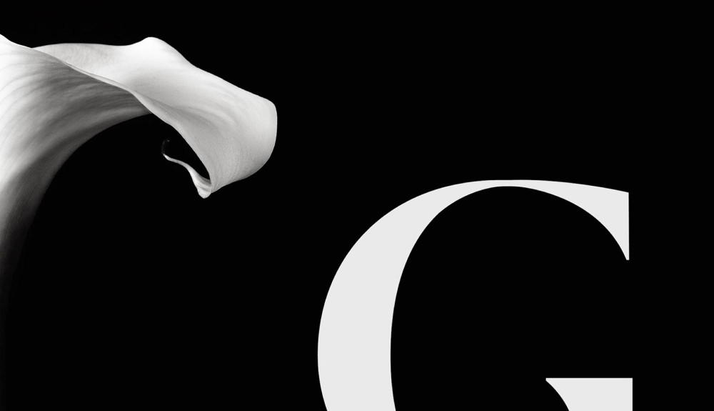
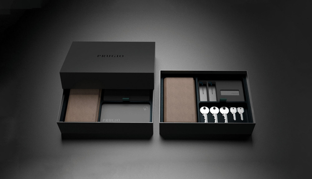
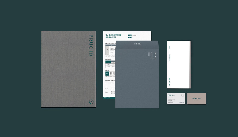
The reimagined Brand Identity (BI) features a design inspired by gentle breezes, using British Green to convey elegance. In addition, a new character was designed along with the typeface-based logo, visually expressing the brand tradition of Prugio. Collaborations with the S/O Project ensured the consistency of the BI, as it is integrated into visual elements like business cards, model houses, and construction barriers. Even small details, such as keyboxes and smart keys, were designed to enhance the premium experience, and the Prugio logo and characters were naturally placed throughout the apartments to create a sense of everyday pride.
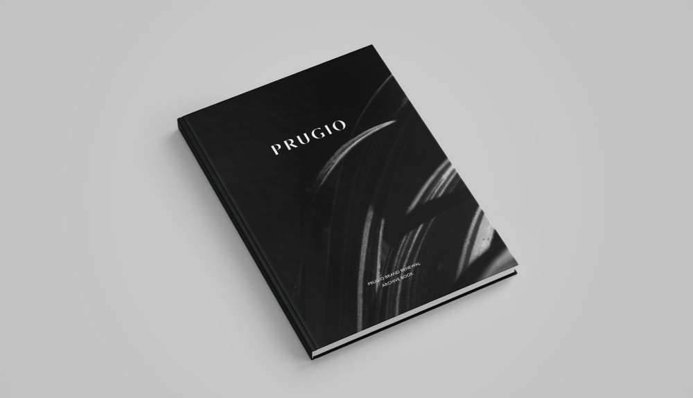
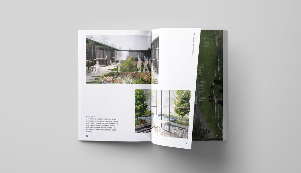
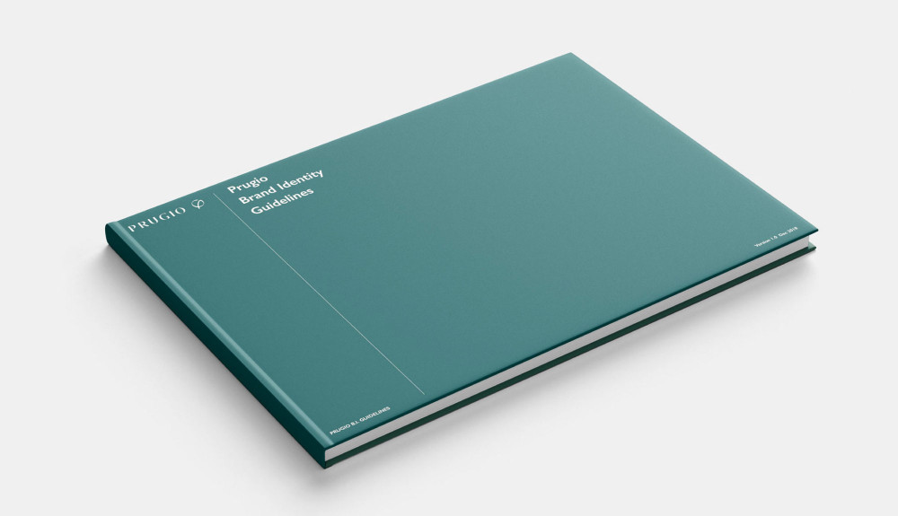
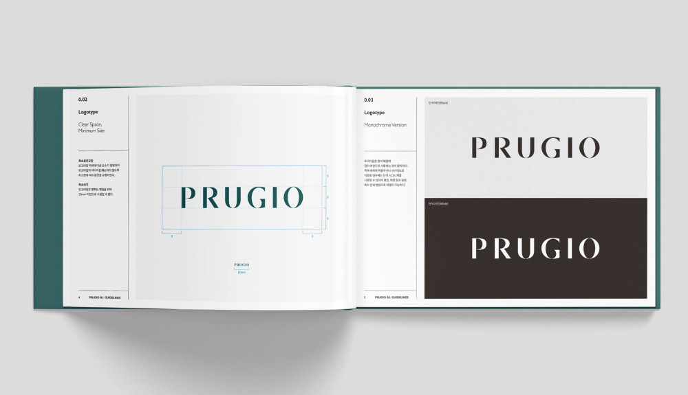
The brand book concisely summarizes the new Prugio philosophy and values, making it easy to recognize the changed image both internally and externally. The brand book is organized around the brand's revised philosophy and clearly communicates the brand's direction to people. It also plays an important role in maintaining and spreading the new image to employees.
